I have very good vision. I like to dream. Once I ate kiwis with the skin on and had an allergic reaction. The truth of the matter is some say I am a
bit peculiar, apparently in a good way.
much more pictures of illos, pillows and things at www.flickr.com/photos/kimssuitcase/
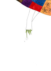
Great use of negative space. The image leads your eye into the white space, and allows your mind to make up what's near. Nice simplicity in the main image.
14 comments:
simple and creative design!
not sure maybe to much white space but the dwg itself i like
Love this one. Reminds me of a child jumping around in the grass.
Great use of negative space. The image leads your eye into the white space, and allows your mind to make up what's near. Nice simplicity in the main image.
Execellent. I like the contrast between the white and the quilt-like patterns at the corner. :)
Yeah, great simplicity and use of space here. Nicely done.
So elegant!
SMooch,
The Tart
I love the simplicity and bits of color.
This one's a winner!!! Great negative space - gives the eye a place to rest and adds even more potential energy to the figure. Love it!!!
Do you do CafePress? I'd love this drawing on notecards - it'd put smiles on my friends' faces.
thanks for all the nice comments.
brandy, i do not do, cafe press just yet, but perhaps in the future and i will be sure to let you know...
Thank you!
[url=http://bqydegmq.com/bjnx/qxae.html]My homepage[/url] | [url=http://pdrmchoj.com/apjs/wkil.html]Cool site[/url]
Nice site!
My homepage | Please visit
Well done!
http://bqydegmq.com/bjnx/qxae.html | http://ijugrnyz.com/senz/smcv.html
Post a Comment